rather than play with it for a long while I've only played for an hour or so.... I think immediate thoughts are more pertinent as they are likely to strike the casual facebook crossover user.... anyway:
1st stage setup fine but adding people to circles was squiffy.... there didn't seem to be any logical order to your friends.... something like Apples quick look would be great where you could chose alphabetically, recently added, most amount of correspondence, say.... I found myself accidentally adding people who I haven't emailed in years... this is not necessarily a good thing!
Stream is confusing... is the default for all circles?... I saw comments from a person I added to a specific circle and am not sure if it is viewable by my friends or not.... I foresee drunken crossposting to the wrong circle
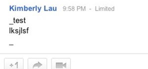
the +1 is really confusing.... it seems that you only see it in google search or something.... I want to be able to use it for a link that I see in the stream or possibly a pic.... more akin to facebooks like button... ideally if you could implement something like a 'dislike' button you'd score really big with all those fb users complaining that you have to "like" something to post a comment that you actually disagree with it!
pics appear with a link but no thumbnails with youtube links or are you supposed to use the vid button?
a killer thing would be able to keep a thread if there's a lot of discussion on it.... maybe be able to drag it to the left column or something.
another really neat thing would be to see where friends etc have posted on outside forums [they would obviously enable this] so you could join in if you felt the urge.... right now you can post comments on external sites by logging via your fb account but those comments don't appear on your fb feed unless you 'follow' that group if they have a fb presence... even then there's no reply function so your interest disappears quickly once it scrolls down a page or so...
just my quick 2 cents for the mo



















1 Response
Hey Jimmy,
As you've continued to use it have you found any of these things easier? Or do you still find yourself wishing they'd make some changes?
I for one agree on the "+1" issue. They should merge the "+1" and "share" links into just "+1". This is how everyone expects it to work as we equate it to the Facebook Like & Twitter Tweet buttons.
Share Your Thoughts